Swirls: James Prez's Ode to Duchamp
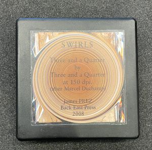
Swirls: Three and a Quarter by Three and a Quarter at 150 dpi (After Marcel Duchamp) is an artist book created by James Prez. The book was created in 2008 and published in Brooklyn, NY by the Black East Press. This is the seventh copy out of a limited edition series of 12, all of which are signed and numbered by the artist.

Introduction
The book Swirls: Three and a Quarter by Three and a Quarter at 150 dpi (After Marcel Duchamp) is held in the Kislak Center for Special Collections, Rare Books and Manuscripts located on the fifth and sixth floors of the Van Pelt-Dietrich Library at the University of Pennsylvania. This particular copy was directly acquired from Prez by the library. Prez’s book is a unique artist book that challenges traditional expectations of what a book should or could be. The following is a description on the books form, content, interpretation, and structure.
Understanding the Artist Book
Intrinsically, the artist book engages two roles – the one of the artist and the one of the writer. In that combination comes the complication of two worlds – art and publishing. The “Art Book” or “Artist Book” pushes the idea of what both art and a book is.[1] What is art as we know it? The idea of “art” itself comes with a multitude of common misconceptions and preconceptions, such that art is meant to be only on display, for the elite, only about beauty or about skill. The same goes for preconceptions about “Books,” such as it must have a traditional codex structure, with pages bound between two covers with written text and a linear narrative.
The “Art Book” challenges the nature of art and books as we know it. Often, when one encounters art, there features a sign reading, “Do Not Touch.” In this case, where art is treated as a book, it offers an unique opportunity to appreciate the carefully crafted content up close, allowing for close inspection and interaction. This approach to art allows it to be touched and fully experienced, breaking down the traditional barrier between the subject and object.
Artist’s books are created by artists, thus, as a work of art in itself. Blending visual and literary arts in a way that challenges what a book is, these books are not merely a collection of images, words, or graphics, but rather works of art in their own right. Their nature, as a result, is highly conceptual or experimental, as their format and design is integral to the relaying of the meaning and message. They can vary in size, shape, and content, and are often handmade or produced in small editions, making them potentially sought after for collections and collectors. Some take the form of traditional books, while others may take on more sculptural exhibition-style qualities.
Most of all, they offer the experience of art in a more intimate and tactile way, playing an important part in explorations of the possibilities of the medium and pushing the boundaries as to what a book is and can be.
James Prez: Visual Author
James Prez is a visual artist and author born and raised in Philadelphia. He earned his MFA from the Visual Studies Workshop in Rochester, NY. His work has since been exhibited at many museums such as the DUMBO Arts Center and Printed Matter. His pieces are featured in many prestigious collections, such as the Museum of Modern Art or the Pennsylvania Museum of Art. He describes himself as an “Art fiddler/publihser” and works at Back East Press in Brooklyn, where he continues his legacy of vanguard production.
Prez constantly critiques, in a satirical manner, popular cultures. His other works include “Dis a Way..Dat a Way,” an artist book filled with photographs of street signs and directions commenting on traditional navigation as well as a flip-book narrative of found photographs from the 1970s titled “Don’t Hang Up!!”.
Swirls: Three and a Quarter by Three and a Quarter at 150 dpi (After Marcel Duchamp)
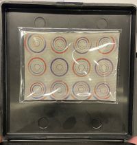
This series has 12 editions, and at the University of Pennsylvania is the seventh. Within this specific size and dpi, there are 21 loose leaf laser printed cardboard cutouts three and a quarter square inches each of distorted swirled photographs. Furthermore, there contains a magnet with an optical illusion with six circles attached to the plastic box. When the box is opened and closed, the circles disappear and reappear in different sizes and colors. Paying homage to Marcel Duchamp’s rotoreliefs, Prez honors the legacy of visual cultures.
Prez made this series in different sizes and dpi’s. Printed Matter holds the signed and numbered sixth edition out of 6. “Swirls: Six and a Quarter by Six and a Quarter at 72 dpi: After Marcel Duchamp.” This version contains an ornate porcelain dish and the magnet. As Printed Matter notes, “With Swirls (After Marcel Duchamp), Prez both satirizes and pays homage to the history of visual culture while positioning himself within Duchamp’s artistic legacy.” [2]
Influences and Inspirations

As noted in its title, Swirls: Three and a Quarter by Three and a Quarter at 150 dpi (After Marcel Duchamp), is inspired by Marcel Duchamp's Rotoreliefs. The book is quite interpretative, yet it offers the reader some hints about understanding it and its references. The University of Pennsylvania has even provided a folded document on what the Rotoreliefs looked like. Duchamp’s Rotoreliefs were a series of optical illusions created by the French Artist in the 1920s. They were essentially spinning discs designed to create the illusion of three-dimensional objects when viewed through a small opening or slot. Similar to Prez’s creation, each Rotorelief was a circular cardboard disc with a series of abstract designs printed on it. When the disc was spun on a turntable or other motorized device, the composition appeared to move, creating the illusion of depth and dimensionality.
Interpretation and Analysis
Once the book is opened, it is made clear that it is all an optical illusion due to the magnetic display on the so-called front cover. However, it is an optical illusion that you can play with. Through the loose leaf square discs, one is able to tile them, compare them, or just look at one or the other. This no specific order already departs from a typical book as we know it. However, it contains an idea and a purpose. While the cover might be plastic with hinges instead of a spine, and loose lead cardboard cut out images instead of connected word filled pages, its purpose is recognition.
Take the popular Kindergarten phrase, “Show and don’t tell.” Prez’s creation does just that. It shows a point can be made in references and visual language. Its message is not clear, and just like Duchamp’s rotoreliefs, it is open to interpretation and may vary depending on the viewer’s perspective. In this case, there is not one way to read it. However, there is one general message of Prez’s artist book – to challenge traditional notions of art and perception through alternative visual approaches and optical illusions. In creating discs supposed to simulate three-dimensional objects, Prez questions not only the limits and two-dimensional aspects of books, but also the fact that both art and books must represent recognizable objects or narratorial subjects in a realistic way. Prez explored the concept that a book can be more abstract and subjective, and that the reader’s perception plays a critical role in shaping the experience of the book.
Reading through Form and Structure
There are different pieces that make up this artist book: the plastic container, the cardboard cutouts and the illusionary magnet. In all of these elements, Prez continues to probe the structures a book can take as well as the ways in which the public can interact and understand it.
The Plastic Box and its Faces
The container, or rather cover, for this book is a black plastic box, 10 x 10 x 3 cm. It replaces the spine with hinges. On the top of the box is a title sticker – a taped on rotorelief with words. It reads, “Swirls / Three and a Quarter / by / Three and a Quarter / at 150 dpi. / (After Marcel Duchamp) / James PREZ / Back East Press / 2008.” Due to the size and materiality of the container itself, the book has a sense of durability and mobility. The box itself has no visible markings or signs of wear other than the slight scratches that appear on the plastic. The material, plastic, shows a signal of modern production. The use of plastic is an indicator that this book steps into a new mechanical age and signals modern production. The hard-nature of the plastic proves a stark contrast to the readability of a typical codex book. As opposed to the interior, which is highly interactive, fueled by movement, the exterior is firm and sets its place.
However, the plastic box is a vehicle for further aesthetic capabilities. Prez utilizes the maximum amount of space with a small area to work with. Not only does it house the looseleaf pages, but also an imitation of a library provenance card and an illusion.


The Interior: Library Cards and Provenance

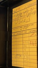
At the bottom of the interior of the box, there is a library card paper insert. At first glance, it appears to be exactly what it is – a description of the provenance as if the book was checked in and out of the library. However, the book was donated directly from the artist to the University of Pennsylvania. It is signed by James Prez in pencil, further honing in on the theme of the scholarly book. Under his large signature is the edition information, 7/12, date, 2008, and title, “Swirls”. Beneath it, the library check out information is full and stamped with red in. However, with a closer look, one can realize that the numbers are made up and the places as well. In a somewhat clear blue stamp, the reader can see, “Indian Office, 1890.” Clearly, the book was not made before 1890.
The inclusion of this library card proves a commentary on the notion and challenges of an artist book. First of all, it compounds the nature of art and its public. Is one to touch it, have easy access to it? Let alone, is one to mark it up once they have read it? The answer to all of these is most of the time no. Here, Prez not only questions the nature of art, but the place and use of the artist book in a library. As Eva Athanasiu writes, “Artist’s book is a complex category… it is a book that refuses to behave like a normal book.”[3] The inclusion of the library card not only pushes the notion that an artist book is an actual book, but also questions the nature of the place of the artist book and the problems that still need to be figured out.
The Interior: Illusions
Right when the container is opened, there is a rectangular magnet still wrapped in plastic. The magnet holds six different circles, each with more circles within that only show when moved. The background of the magnet is white, while the graphics themselves are colored. This kinetic magnet possesses movement and shows a design in motion. This movement is controlled by the angle of the top of the container, adding an element of dynamism and interaction and creates a visually engaging experience. In its very effect, it pays homage to the impact of Duchamp’s rotoreliefs and the fourth dimension of art and space, challenging traditional notions of static art and raising engagement.
This incorporation challenges traditional ideas about the nature of a book as well. Historically, books are known to be static, fixed objects, read linearly and passively. However, with the inclusion of the illusion magnet, Prez introduces the element of interaction and unpredictability to disrupt all known conventions.
Cardboard Cutouts

The 21 cardboard cutouts are laser printed colored distorted images, each 8 x 8 cm. They are stacked in no particular order. Once you open the box you are aware that it is all an optical illusion, allowing the reader to play with the visuals and try and create their very own. All of them have different images and different colors. In some of them, a semblance of the original image can be made out through the edges. Recurring within these illustrations is taped up posters against walls, where the edges with tape can still be seen. The rest seem to be black backgrounds with colorful swirled geometric designs.
However, there is one in particular that presents quite notable. Rather than a poster or simply design, the one on the top left appears to be a painting. Through the edges, the ornate gold frame can be made out. The gold continues to swirl through the center and no clear painting can be made out. This recreation of a rotorelief directly challenges the art by reworking its context and portrayal. The method of swirling, as mentioned previously, gives it another dimension and use. While it might be hidden under the stack of the others, it is an important element to his commentary.
These pages fulfill no narrative or story. Rather, they evoke something in their readers – autonomy. Like Dirk van Weelden described, “Duchamp’s interest was not in concepts or ideas, his drive was towards the virtual ambiguous, irrational side of perception.”[4] Prez’s intentions offer the same motives as clearly seen via his aesthetics of ambiguity through swirls.
References
- ↑ Drucker, J. (1995). Century of artists’ books: The artist’s book as idea and form. Granary Books.
- ↑ James Prez - swirls : Six and a quarter by six and a quarter at 72 dpi : After Marcel Duchamp. Printed Matter. (n.d.). https://www.printedmatter.org/catalog/24978/.
- ↑ Athanasiu, E. (2015). Belonging: Artists’ Books and Readers in the Library. Art Documentation: Journal of the Art Libraries Society of North America, 34(2), 330–338. https://doi.org/10.1086/683388.
- ↑ Weelden, D. van. (2022, June 22). Black Coffee. Marcel Duchamp’s Pataphysical Sensism. RELIEF - REVUE ÉLECTRONIQUE DE LITTÉRATURE FRANÇAISE. https://www.academia.edu/82032694/Black_coffee_Marcel_Duchamp_s_pataphysical_sensism


